9 inspiring event website examples
Event websites are platforms where you share information about your upcoming event. These sites are vital as they create excitement and encourage people to attend.
This article will explore 9 outstanding event website examples that showcase clever design, user-friendly features, and effective marketing strategies. From business conferences to music festivals, these examples will hopefully inspire you to create an amazing event website.
Top 9 event website examples
Let’s explore our list of 9 inspiring event website examples created with our Event Website Builder and see what makes each one special.
1. FOD
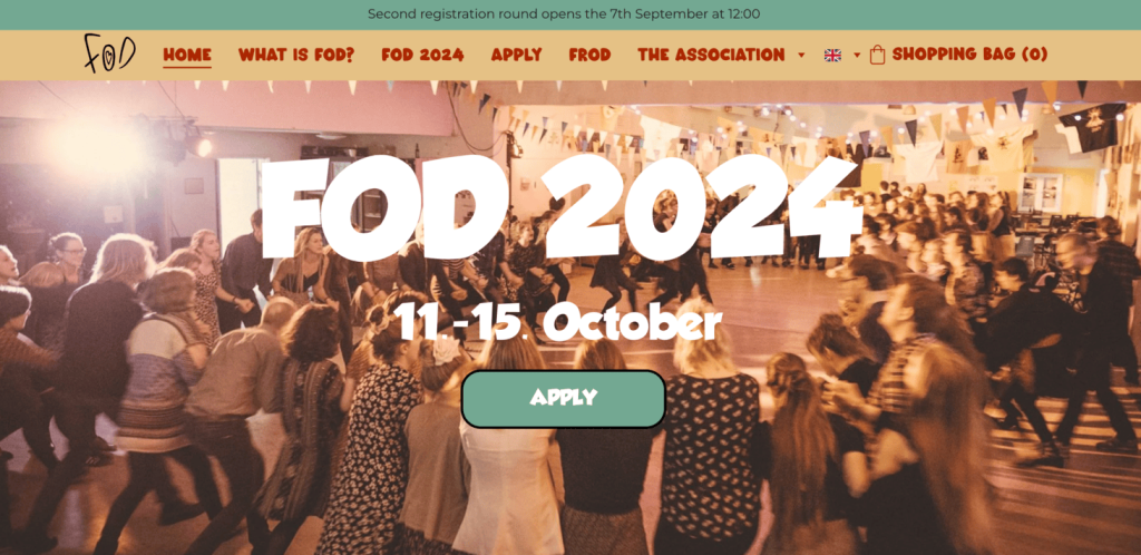
FOD is a folk music and dance festival specifically designed for young people. With new themes every year, it has an energetic atmosphere where both experienced dancers and curious enthusiasts can explore the world of folk culture.
What we like most about this site:
- The vibrant colors and energetic visuals give visitors an indication of the event atmosphere.
- The teaser video gives a glimpse of the fun activities at the event, which can be more engaging for visitors.
2. Spring Implosion Color Run
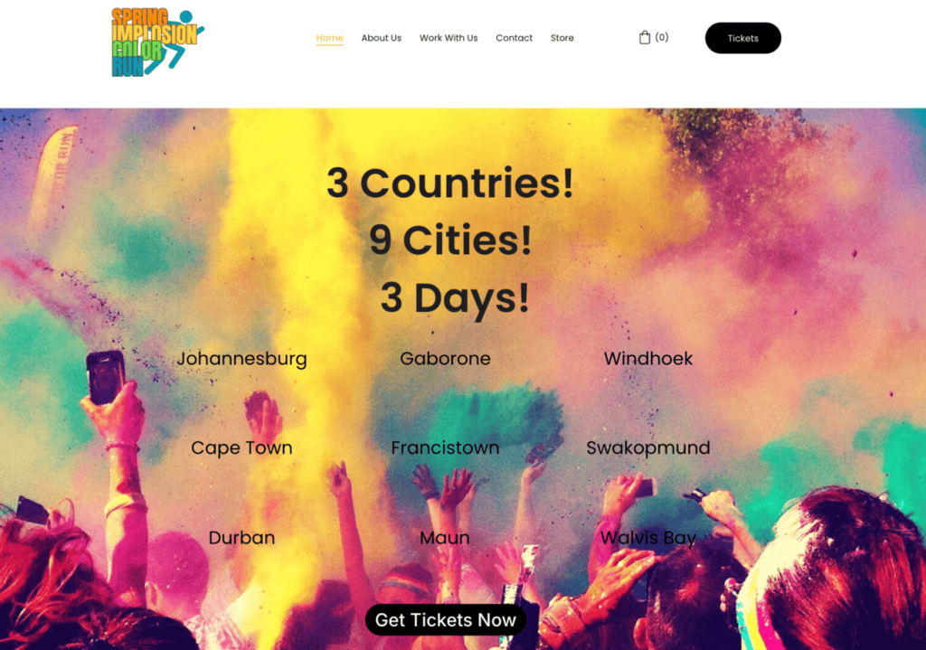
The Spring Implosion Color Run is an exciting event that combines running with a music festival. Spanning nine cities in three countries over three days, this vibrant event celebrates color, culture, and connection.
What we like most about this site:
- The colorful visuals instantly draw attention and give visitors an indication of what to expect at the event.
- Highlighting that the event takes place in “3 countries, 9 cities, 3 days” shows that it is very popular.
- Clear details explain the running distances, musical performances, and activities for the whole family.
3. High Vibe Women
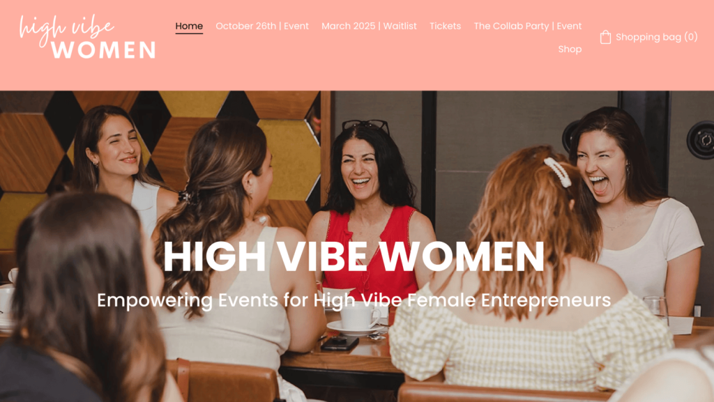
High Vibe Women offers networking events for female entrepreneurs in Canada. Founded in 2021, the events enable business owners to connect, support each other, and share experiences. These gatherings are designed to be different from typical networking events, emphasizing genuine relationships and inclusivity.
What we like most about this site:
- The use of vibrant colors creates a feeling of energy and positivity, which aligns well with the brand.
- Showing testimonials addresses common concerns that potential attendees might have and gives them a concrete idea of what to expect.
- Mentioning the next event is sold out and that people can join the waitlist for next year’s event creates a sense of scarcity, which can increase the desire to attend future events.
4. Manufacturers Energy Security Summit
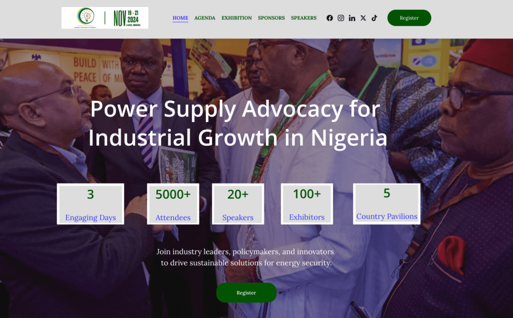
The Manufacturers Energy Security Summit is a major conference bringing together attendees from the energy industry in Nigeria. The event allows industry leaders and policymakers to explore solutions and strategies for improving the country’s energy infrastructure and supporting economic growth.
What we like most about this site:
- The stats about the number of attendees, speakers, exhibitors, and country pavilions paint a picture of how big this event is.
- The countdown timer showing how much time is remaining until the event starts is a great way to encourage people to signup.
- Three registration options – Exhibit, Sponsor, Attend – give clear choices about how you can be involved in the event.
5. The Photography Workshop
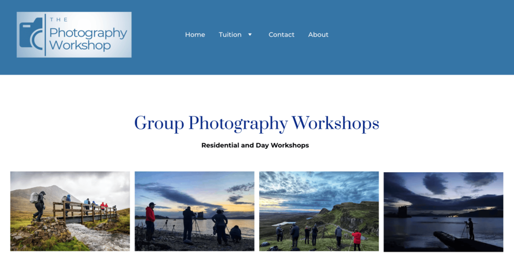
The Photography Workshop offers training and workshops to people who want to improve their photography skills. Led by experienced photographers with teaching backgrounds, the workshops can be completed in a one-on-one setting or a group event, often in stunning locations.
What we like most about this site:
- The clean and user-friendly layout enables visitors to easily navigate through different sections to find the type of workshops that are right for them.
- High-quality images are shown throughout the site, displaying the photography skills that participants can hope to achieve.
- The website has a responsive design, ensuring users have a positive experience whether they are on a desktop or mobile device.
6. Yanyi Lu Music
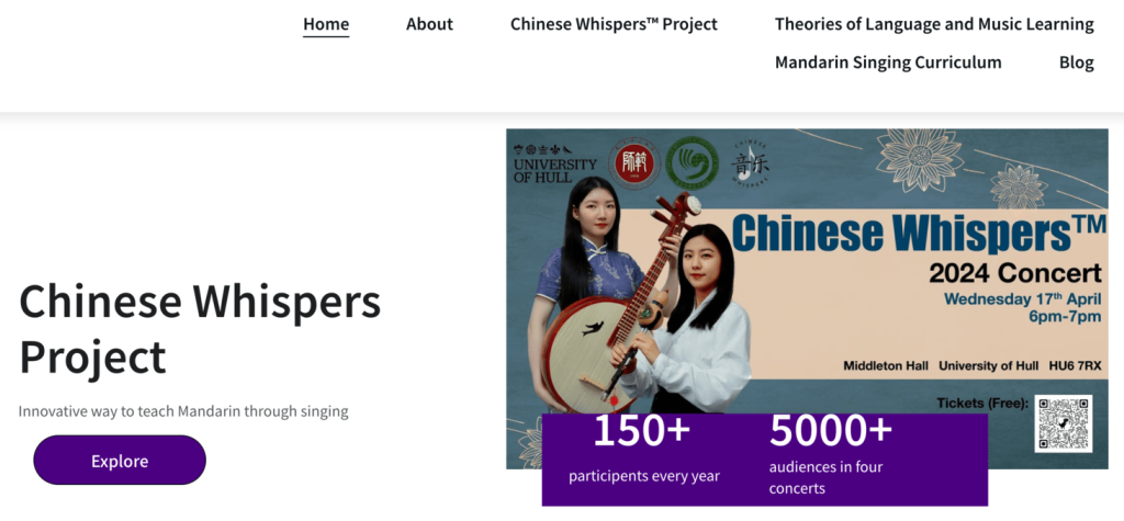
Dr. Yanyi Lu has created an innovative way to teach music and language through singing. Her events explore different ways people learn, and aims to help students improve their music and language skills at the same time.
What we like most about this site:
- The videos of past concerts help you get a sense of what to expect at the events.
- Dr. Lu explains the theory behind her teachings, adding credibility to her unique methods.
- Sharing her personal musical journey makes Dr. Lu more relatable to potential attendees and provides context for her expertise and passion.
7. Health Tourism Industry Conference
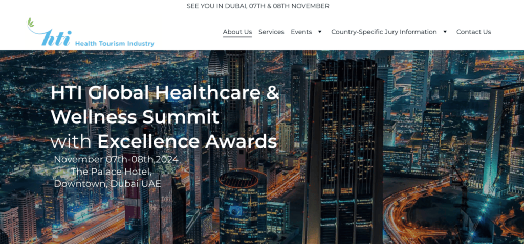
The Health Tourism Industry (HTI) Conference and Expo brings together industry experts to address challenges and explore future opportunities in health tourism. The event connects professionals to share insights, network, and celebrate achievements.
What we like most about this site:
- Clear event information like date, time, and location is visible straight away, making it easy for visitors to find relevant information.
- Stats about the number of attendees, countries represented, and decision makers stands out.
- Describing past events gives potential attendees a sneak peek into future events.
8. JozaWorld Tours
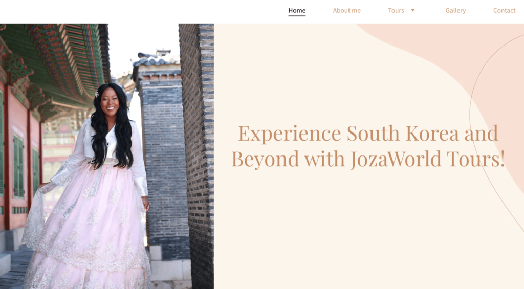
JozaWorld Tours offers multi-day, guided tours to South Korea, Thailand, and Japan. Participants explore the local culture through activities like wearing traditional clothing, visiting famous sites, and trying local food. The tours include accommodation in a shared house called The Bestie House and offer both planned activities and free time.
What we like most about this site:
- Calling visitors besties can make solo travelers feel more at ease about joining a group tour.
- Providing detailed information about the tours, including itinerary and pricing, helps customers fully understand the unique experiences offered.
- Including photos of past tours helps potential customers see themselves having a great time on the trip, encouraging them to sign up.
9. Masterclass DISC
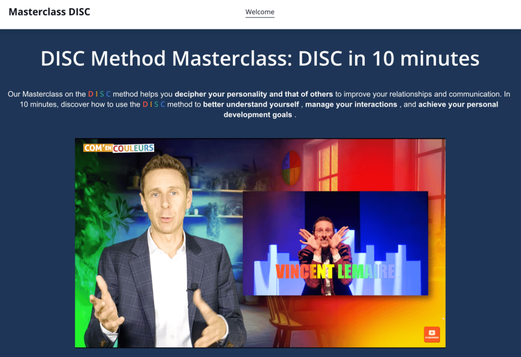
The Masterclass DISC events focus on helping attendees understand different personality types. By learning these personality types, you can better understand yourself and others, which helps improve your communication and relationships.
What we like most about this site:
- The prominent video explaining the method and showing clips from past events provides an engaging introduction and helps potential attendees understand more about the events.
- The clear call-to-action buttons stand out on the pages and encourage visitors to sign up.
- Listing “5 concrete benefits” to learning the method clearly shows how the events will impact the visitors’ lives and work.
How to use these ideas in your event website
After exploring these inspiring event website examples, let’s see how you can implement similar designs when you create your event website using Hostinger Website Builder.
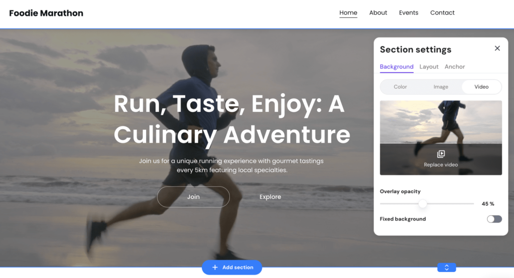
Video background
To add a video background, click the section where you want the video.
Select Edit section → Video, then choose Replace video to upload your new background.
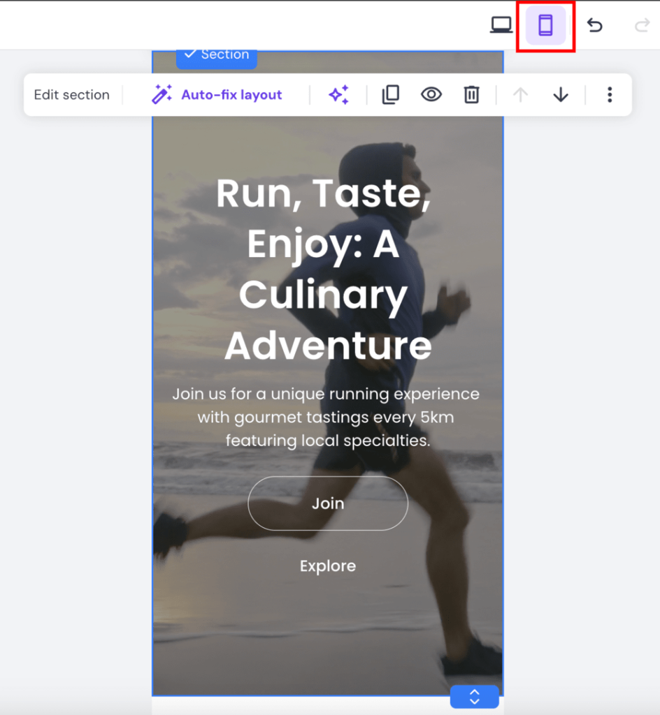
Responsive design
Websites made with Hostinger Website Builder are already mobile responsive, ensuring your site looks great on all devices.
To preview how your site looks on other devices, click the phone icon. You can make changes that will appear only on mobile devices if needed.
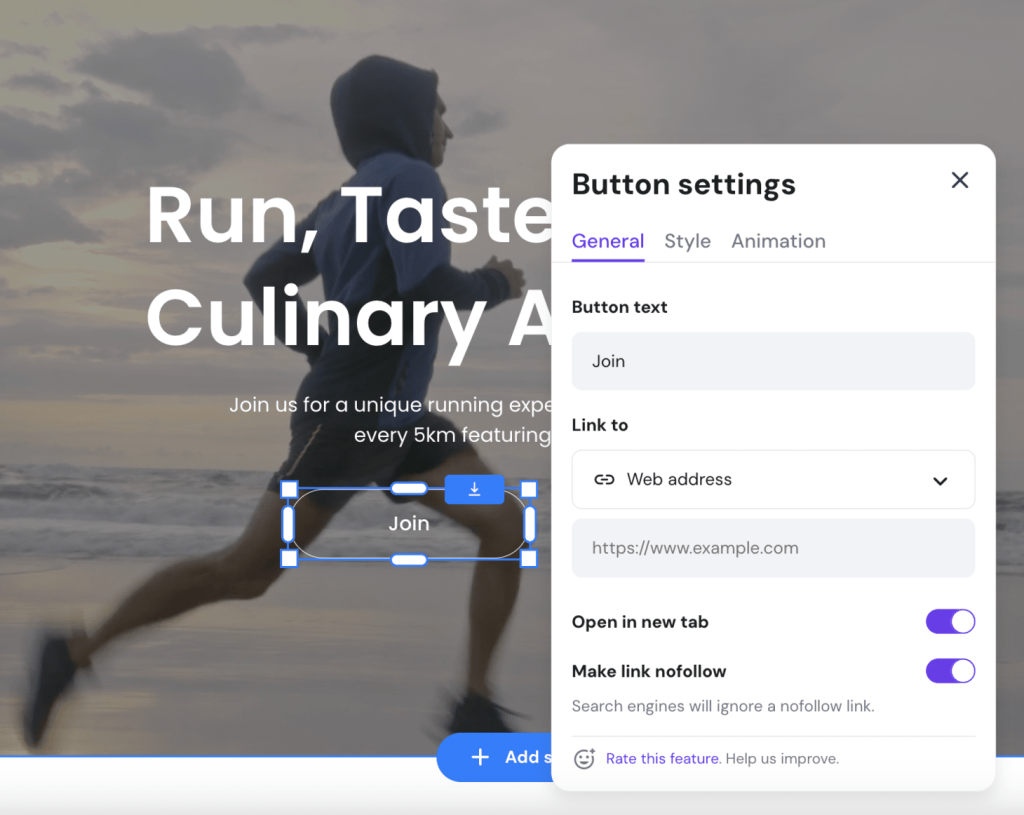
Call to action buttons
A great way to encourage people to sign up for your event is to have call-to-action buttons that stand out. With Hostinger Website Builder, you can easily adjust button colors, add animations, and change the styles to attract attention.
Event descriptions
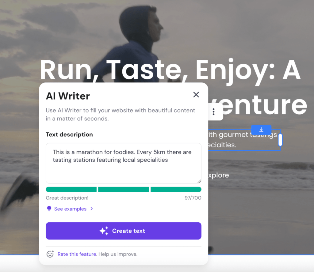
Your descriptions need to be detailed and interesting enough to encourage visitors to sign up. This can sometimes be challenging, but Hostinger Website Builder makes it easy.
Simply add a Text element and click on AI Writer. Then describe the text you want to create and let AI do the rest.
Conclusion
Whether you’re planning a small local meetup or a large international conference, a well-designed event website can help to attract attendees and create excitement.
As we’ve seen here, the best event website examples share common features like user-friendly layouts, detailed information, high-quality photos, clear call-to-action buttons, and testimonials.
Keep these elements in mind when you’re developing a website for your event to inspire people to attend.
Event website examples FAQ
What features should event websites have?
Successful event websites should have an appealing design, easy navigation, mobile-friendly layout, clear event details, photos and videos, and a simple way to register or buy tickets. Adding frequently asked questions and testimonials from past attendees can also make event websites more effective.
Can I create a website for a temporary event?
Yes, creating a website for a temporary event is a great idea because it helps to share event details, sell tickets, and get people excited about the event. Even if it’s a one-off event instead of a recurring event, you can still benefit from having an event website.


