10 best product page design examples to boost your sales
A product page is your digital storefront – a place to showcase your product’s features, benefits, and reasons for purchase.
In this guide, we’ll showcase 10 standout product pages built with Hostinger Website Builder. By analyzing them, you’ll learn how to boost your sales by providing clear details, attractive photos, and a satisfying user experience.
What is a product page?
A product page highlights the item for sale and is vital to an online store. It should provide all the necessary product details, including the visuals and pricing information.
Top 10 product page design examples
Let’s explore 10 product pages created with Hostinger’s eCommerce website maker and see why they’re effective.
1. Manic Cherry
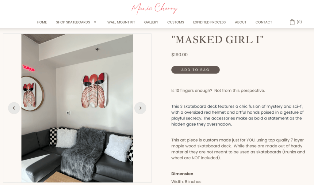
Manic Cherry is an Arizona-based company that creates unique skateboard wall art. The company works with artists like Caroline Ellis to create designs that appeal to skateboard enthusiasts and art lovers. Customers can also personalize their skateboards, which helps make the shopping experience more engaging.
Their product pages excel due to:
- High-quality photos. They use high-resolution product photos that look professional. Each image is clear and well-lit and showcases the items from multiple angles and in different settings.
- Consistent branding. The photos all have a vibrant and playful style, which matches the company’s overall look and feel.
- User-friendly layout: The page is clear and organized, with separate sections for product details, images, and pricing. An intuitive website layout makes it easy for customers to find the information they need.
2. MentorHer Africa

Mentor Her Africa is a non-profit organization that empowers young women in Africa who are involved in the cybersecurity industry. The organization aims to create a network of mentors to guide and inspire the next generation of female leaders. It offers resources, training, and opportunities for mentees to grow personally and professionally.
The page that explains Mentor Her Africa’s application process is successful for a few key reasons:
- Clear details. The page provides precise information about the application process, including who is eligible, the benefits of joining, and what applicants can expect. This helps build trust and encourages people to apply.
- Showing testimonials. Including success stories from past participants can show the program’s positive impact and motivate new applicants.
- Compelling call to action. The page has clear, eye-catching buttons encouraging visitors to apply. This makes it easy for people to take the next step.
3. Formula Fitness India
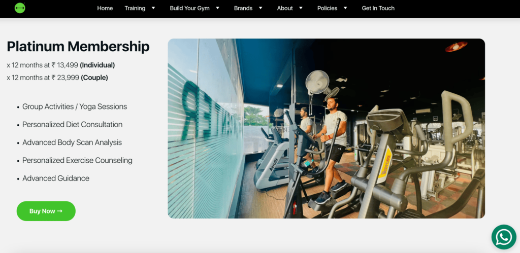
Formula Fitness India is a company that helps people improve their health and well-being. They offer various services, including personalized exercise programs, nutrition advice, and fitness classes designed for people with varying levels of fitness and ambition. The company wants to create a supportive community where people can reach their goals with the help of experts.
The product page that explains Formula Fitness India’s membership options is effective for a few key reasons:
- Clear membership plans. The page displays all the different membership options, making it easy for potential customers to understand what’s available. It details the benefits, duration, and price of each plan.
- Engaging visuals. The page has real-life photos and a clean, attractive design. This helps draw attention to the important information while keeping the page inviting.
- Easy communication. The page has a WhatsApp button that lets visitors quickly contact the company. This makes it easy for people to ask questions or get help in real time, improving the overall user experience and encouraging people to engage with the company.
4. LoopyCustoms
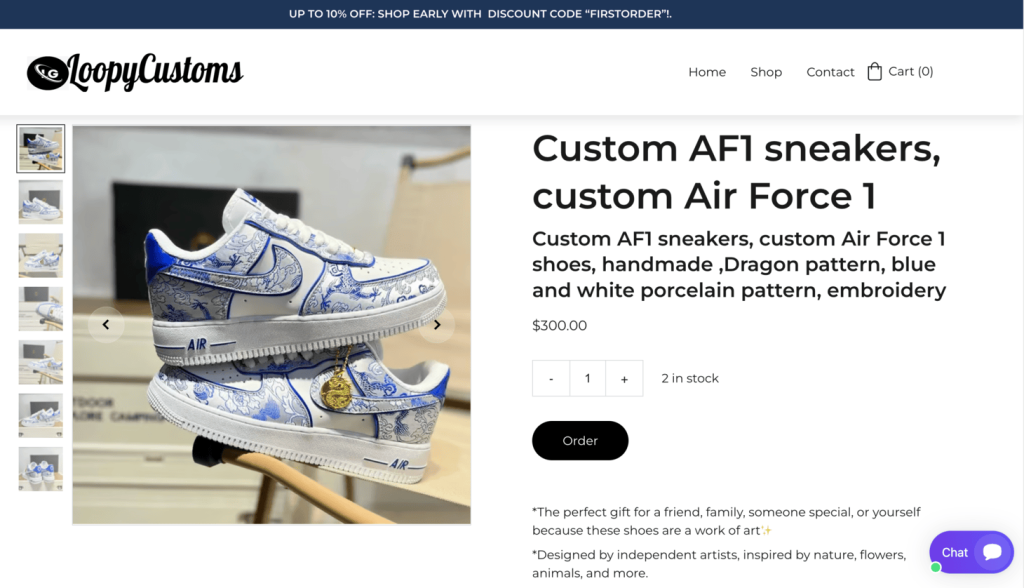
Loopy Customs is a business that specializes in creating custom-designed sneakers. The company believes that everyone should be able to express their unique style. They aim to provide high-quality craftsmanship and excellent customer service so that each pair of shoes is an extension of the customer’s personality.
The product pages on the LoopyCustoms website are effective for a few key reasons:
- Clear photos. The pages feature multiple high-quality images of the shoes from different angles so customers can see the creative designs and quality of the sneakers.
- Detailed information. The descriptions tell visitors everything about the shoes, including what inspired the designs, the materials used, and how to care for them. This helps customers understand what they’re buying.
- Showing discounts. LoopyCustoms shows a discount code at the top of each page, which can encourage customers to purchase since they feel like they’re getting a better deal.
5. JozaWorld Tours

JozaWorld Tours specializes in providing unique and personalized travel experiences. A passionate traveler started the business to share her love of travel with others. JozaWorld offers guided tours, adventure trips, and cultural experiences that help travelers connect with the places they visit.
Here are a few reasons why JozaWorld Tours’ product pages work well:
- Engaging photos. The pages feature high-quality images of previous tour guests at beautiful sights and attractions. These visuals help get potential travelers excited about the trips and give them a sense of what they can expect.
- Detailed schedule. The pages provide a full schedule of each tour’s daily activities and highlights. This detailed information helps customers understand exactly what the trip includes.
- Transparent pricing. The pricing for the tours is clearly stated, along with any additional costs or items included. This transparency helps potential customers make informed decisions without worrying about hidden fees.
6. High Vibe Women
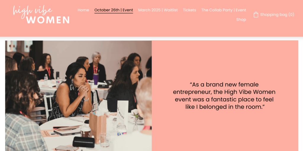
High Vibe Women is a community and platform that helps and supports women in their personal growth and business start-ups. The company offers different resources, like workshops and networking events, to help women build meaningful relationships with other women entrepreneurs.
Here’s what works well on the High Vibe Women product page:
- Consistent style. The pages use bright colors and engaging visuals that match the overall style and energy of the events, giving potential attendees an idea of what to expect.
- Detailed information. The description explains the purpose of the events and the benefits of attending. It speaks directly to the readers’ desire to connect with like-minded women, highlighting how they can be part of a supportive community and hear from inspiring speakers.
- Real testimonials. The page includes positive testimonials from people who have attended the events before, which helps show that they are valuable and worth attending.
7. Buckeye Plans
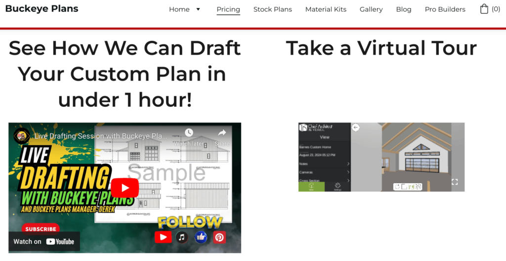
Buckeye Plans is a company that makes house plans. It helps professional builders and people who want to build their own homes with designs that they can easily customize.
Here’s what works well on Buckeye Plans’ product pages:
- Virtual tours. This feature allows customers to see what a realized design would look like. It helps customers to understand how big the spaces are and what it might feel like inside.
- Video explanation. The company makes it easy for people to use their virtual tour feature by providing a video explanation. This helps to highlight the customization process and the quality of the designs.
- Chatbot service. Having a chatbot that can address questions or concerns in real time can help reduce uncertainty and potentially make people more likely to buy.
8. Anxiety Breakthrough
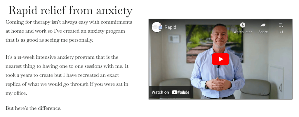
Anxiety Breakthrough is a business in the UK that supports people dealing with too much anxiety or stress. They offer different ways to help, such as talking to a therapist, joining group classes, and taking online lessons to learn how to handle anxiety better.
Their website works well in a few different ways:
- Video explanations. A video that explains their programs helps customers to better understand how they can help. Seeing real people in the videos explain how helpful the programs are can help potential customers feel more comfortable with the services
- Customer testimonials. Highlighting the positive experiences of people who have used their programs is a great way to build trust and credibility with potential customers.
- Extensive FAQ section. By featuring a list of frequently asked questions with extensive answers, the company helps people feel more confident in their services.
9. Wild Slope Bikes
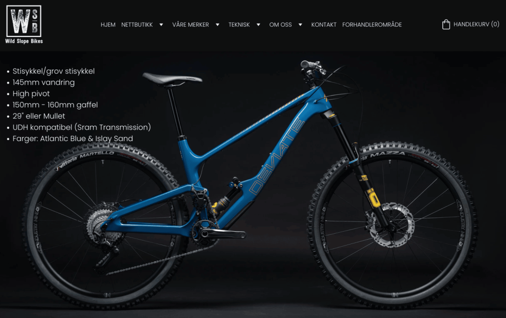
Wild Slope Bikes is a store in Norway that sells mountain bikes, road bikes, and electric bikes. They also fix bikes from their repair shop, ensuring customers are ready for trails and roads.
Their product pages work well for a few key reasons:
- High quality photos. They use clear, high-resolution photos that match the brand’s style and help customers understand the products better.
- Quick popup windows. When you click on a product, a window pops up with further details about it, such as pricing and call-to-action buttons. This feature makes it easy for customers to shop and to add products to their cart.
- Different payment options. By offering several ways to pay, the company makes it convenient for buyers to shop. This can help to reduce cart abandonment rates as customers can easily choose their preferred payment method.
10. Divine Life Mastery
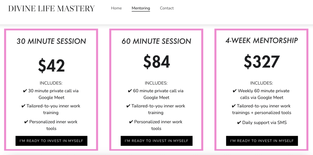
Divine Life Mastery is an online school that helps people improve their careers. It connects people with mentors who give advice and support. These mentors meet with students regularly to discuss career goals, learning new skills, starting businesses, or personal growth.
Here are a few reasons why their product pages work well:
- Various packages available. The page clearly outlines the different mentoring packages, allowing potential clients to choose onee that best fits their needs and budget.
- Personalized call-to-action. The business emphasizes a personalized call-to-action. Rather than simply asking people to buy, it asks them to invest in themselves. This approach can make the process feel more personal instead of transactional.
- Appointment setting feature. Allowing potential customers to set a convenient time for them can lead to higher conversion rates, as it builds trust and shows that The DLM Academy cares about each person’s needs.
Conclusion
A great product page design is vital for every online store. By looking at 10 effective examples built with Hostinger Website Builder, we’ve identified the key elements:
- Using high-quality photos
- Writing clear product descriptions
- Showing positive testimonials
- Having a clean, easy-to-use layout
Whether you’re new to selling online or want to improve your current product pages, these are all great examples to help you sell more of your products.
Product page design FAQ
What are the key elements of a successful product page design?
A successful product page design should use great photos and videos of the product, detailed information, and clear call-to-action buttons. The page layout should be user-friendly and work well on all devices.
How can I optimize the product images on my page?
To optimize product images, use high-quality photos at least 1000 pixels wide. Choose file types like PNG to make files smaller without losing quality. This helps pages and images load quickly. Add descriptions to the photos and use clear file names to help search engines understand what your pictures are about.
How can I incorporate trust signals into my product page design?
To build trust on your product page, display customer reviews and different payment options. Include clear return policies, provide easy ways for customers to contact you, and ensure that your page looks professional.
What are the benefits of a product page?
Product pages are where you can showcase what you’re selling. It’s where you can provide important details and photos about your products, helping you sell more. They also help you build your brand by showcasing positive reviews from customers who have bought your products.


