Hostinger Horizons: web app design tips
As an AI-powered web app development tool, Hostinger Horizons uses natural language processing (NLP) to interpret your prompts and generate the desired results. You can ask it to design your web app to match specific brand aesthetics, user experience (UX) guidelines, and functionality requirements.
While Hostinger Horizons simplifies the process, you still need to make informed design choices. Ignoring key visual and usability principles can result in an app that looks beautiful but lacks functionality, which may lead to poor user engagement and high bounce rates.
That’s why this guide covers proven web app design tips for Hostinger Horizons, along with prompt examples that follow key design principles. By the end, you’ll be able to create a web app that’s visually appealing, user-friendly, and fully functional.
Web app design tips with Hostinger Horizons
In this section, you’ll learn essential best practices for designing web apps and how to apply them when writing prompts for Hostinger Horizons.
1. Use examples of existing web apps in your prompts
If you’re unsure how to describe your web app’s design or functionality, you can reference well-known web apps as examples. For instance, you might specify:
I want swipe-based navigation like Tinder.
The app should use flashcards similar to Duolingo for learning exercises.
By doing so, Hostinger Horizons can better understand your intent and generate an app that matches with your vision.
However, while it’s okay to draw inspiration from existing web apps, avoid directly copying their designs or functionality to prevent copyright and legal issues. Instead of replicating another app, describe the features you like and ask Hostinger Horizons to create a unique layout and look.
For example, instead of saying:
Make a to-do list web app exactly like Todoist.
Try:
Create a modern to-do list app inspired by Todoist but with an original design. Use a clean, minimalist interface with color-coded tasks. Users should be able to set reminders and drag-and-drop tasks between categories.
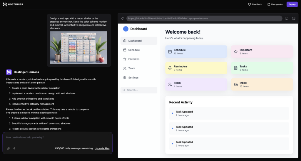
You can also upload reference screenshots of layouts, buttons, or color schemes you like. This helps Hostinger Horizons generate an app that reflects the aesthetic and functionality you have in mind while keeping the design original. Here’s how:
- Hit the Upload file button in Hostinger Horizons’ prompt box.
- Select the reference image you want to use.
- Type a prompt like this:
Design a web app with a layout similar to the attached screenshot. Keep the color scheme modern and minimal, with intuitive navigation and interactive elements.
2. Choose fonts that balance readability and style
Fonts play a crucial role for ensuring readability, good user experience and a professional tone. Using the right fonts makes your web app feel modern and user-friendly, while the wrong one can make it difficult to read and visually unappealing.
When choosing fonts for your web app, consider:
- Readability – use clean, easy-to-read fonts to enhance the user experience.
- Consistency – stick to one or two fonts to maintain a professional and cohesive look.
- Accessibility – avoid overly decorative or thin fonts that reduce legibility.
Some popular and highly readable fonts for web apps include:
- Inter – a modern sans-serif font optimized for screens.
- Roboto – clean and versatile, widely used in mobile and web interfaces.
- Open Sans – a neutral, friendly font that enhances readability.
- Lato – stylish and contemporary, suitable for UI elements.
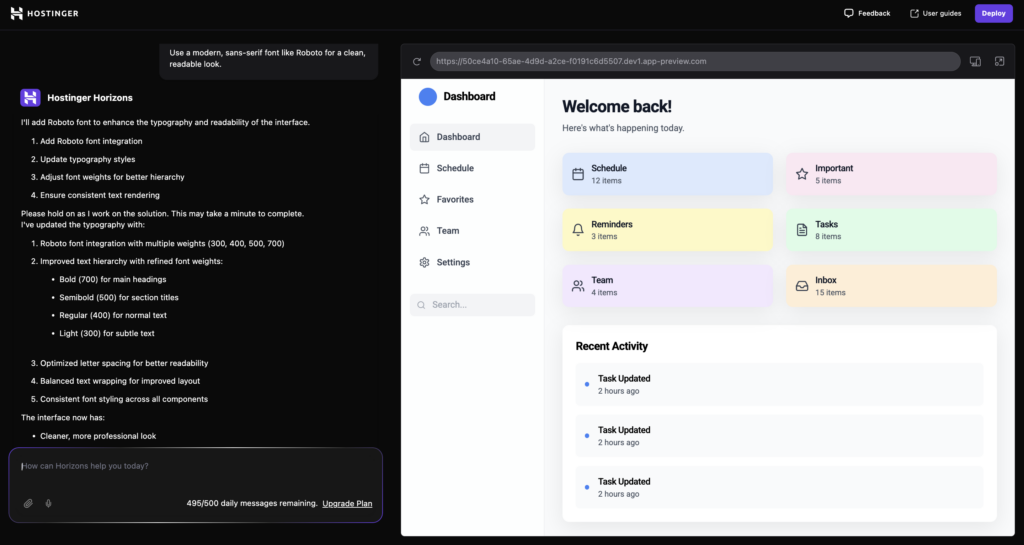
If you need help to specify fonts in Hostinger Horizons, try a prompt like:
Use a modern, sans-serif font like Roboto for a clean, readable look.
To ensure good readability, follow these font size guidelines:
- Headings – 24px–32px (bold for emphasis).
- Subheadings – 18px–22px.
- Body text – 14px–16px (optimal for most users).
- Buttons – 16px–18px (bold for better visibility).
You can refine your font choices using these prompt examples:
Apply Open Sans for body text and Lato for headings. Maintain a 16px body text size and 24px for headings.
Set button text to 18px bold for visibility, with a high-contrast color.
We also suggest you keep these additional tips in mind:
- Use sans-serif fonts for a clean, modern look.
- Maintain contrast between text and background for better accessibility.
- Avoid using too many different weights or styles, as this can make the user interface (UI) look cluttered.
Suggested reading
Learn more about web accessibility principles and how to make your web app accessible in our comprehensive guide.
3. Optimize button styles for usability
A button guides user interaction within a web app. That’s why you must design buttons that ensure users can navigate, take action, and complete tasks with ease. There are two main types of buttons: primary and secondary.
A primary button is the main action button, and it should stand out to drive key actions, such as submitting a form or completing a purchase. A secondary button provides alternative options, like canceling an action or navigating to a different section, without drawing too much attention.
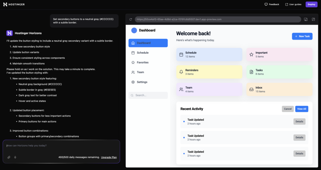
To specify button styles in Hostinger Horizons, write clear prompts like:
Design primary buttons with a bold color (#007BFF) and rounded corners (8px) for a modern look.
Set secondary buttons to a neutral gray (#CCCCCC) with a subtle border.
Besides making primary buttons stand out while keeping secondary buttons less prominent, follow these best practices for button design:
- Use large enough buttons – for accessibility, buttons should be at least 44×44 pixels so that they’re easy to tap on both desktop and mobile devices.
- Choose rounded corners – rounded corners, like an 8px radius, make buttons look friendlier and more intuitive, improving the user experience.
- Maintain button consistency – keep button styles uniform in color, shape, and size to create a cohesive design in your web app.
Here are additional prompt examples that apply these button design tips:
Use rounded buttons with an 8px border radius for a modern look.
Make sure all primary buttons have a hover effect with a slightly darker shade.
4. Use white space effectively
White space (also known as negative space) is the empty area between elements in a web app. While it may seem like a waste of space, it’s actually crucial in improving readability, preventing visual clutter, and guiding user focus.
Without enough white space, a web app can feel overcrowded, difficult to navigate, and visually overwhelming.
In Hostinger Horizons, you can use these prompt examples to adjust spacing:
Ensure at least 20px of padding between sections and 10px margin around elements for a clean layout.
Apply 40px spacing between sections to create a structured, readable interface.
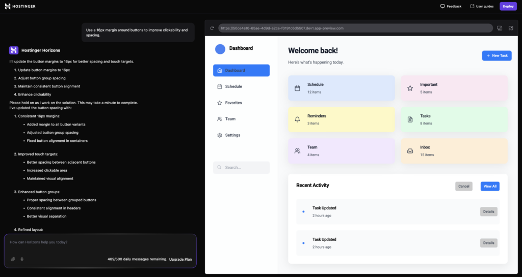
Use a 16px margin around buttons to improve clickability and spacing.
When defining spacing for your web app, follow these guidelines:
- Between sections – 40px–60px (separates content and improves flow).
- Between elements, such as buttons, images, and forms – 16px–24px (creates visual clarity and prevents elements from feeling crowded).
- Around text blocks – 10px–16px padding (improves readability and makes text easier to scan).
5. Pick backgrounds and color palettes for visual hierarchy
A proper web application design has a sense of depth that separates the background from the foreground, which you can achieve through different methods. For example, you can use different colors or patterns.
This is one of web design best practices that help users easily distinguish important elements and information in your application.
The most basic way to create this visual hierarchy is by using a background that doesn’t overpower more important elements, like text or buttons. Here are the best practices for a good background design:
- Use contrast – apply contrasting colors to make important information stand out more. Using colors of similar values, like dark grey and black, will blend visual elements and make distinguishing between them difficult.
- Implement softer tones – avoid using overly contrasting color pairs like absolute white and black since they can cause eye strain. Instead, choose a softer color, like light grey with pale beige.
- Minimize accent colors and patterns – limit the palette for your background to one or two colors and avoid complicated patterns. A complex design will make the backdrop too distracting.
- Provide light and dark mode – give users the option to switch between dark and light-colored backgrounds. These modes ensure your application is usable in both bright and dim environments.
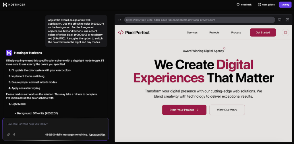
Here’s a prompt example for creating a background design with a clear visual hierarchy:
Adjust the overall design of my web application. Use the off-white color (#E3E2DF) as the background. For the foreground objects, like text and buttons, use accent colors of either black (#000000) or raspberry red (#9A1750). Also, give the option to switch the color between the night and day modes.
6. Set up intuitive navigation: menus, sidebars, and headers
Intuitive navigation elements are key to a user-friendly web application. They help users locate a specific page, find information, and use your app more easily.
Optimal usability entails a higher retention rate. If users can navigate and utilize your application efficiently, they are more likely to keep using your product.
Here are tips for creating intuitive web navigation for optimal user experience:
- Consider padding – use at least 12px of padding for all menus, sidebars, and headers. Padding separates elements in your navigation menu for easier interaction and identification.
- Use 16px font – apply at least 16px font for all text in your navigation elements. This helps users distinguish menus more easily, especially for those on smaller screens.
- Avoid an overly deep hierarchy – keep nested menus at a maximum of two levels deep. Going beyond this will make navigation complicated because most of the menus are hidden.
- Implement ARIA roles – add ARIA labels to all interactive navigation elements on your web application. These labels allow users to identify each element using a screen reader and interact with it via keyboard for improved accessibility.
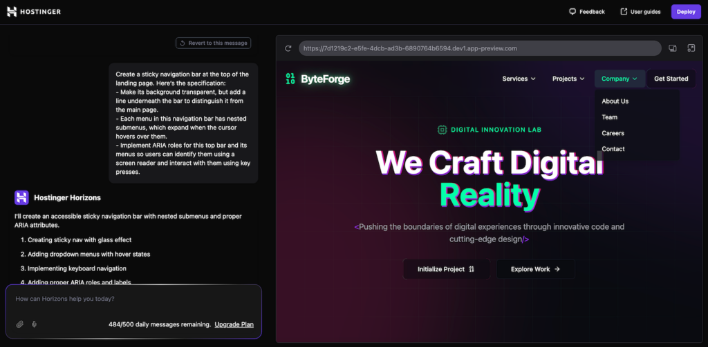
Here’s a prompt example for creating a top navigation bar with optimal design and accessibility:
Create a sticky navigation bar at the top of the landing page. Here’s the specification:

- Make its background transparent, but add a line underneath the bar to distinguish it from the main page.

- Each menu in this navigation bar has nested submenus, which expand when the cursor hovers over them.

- Implement ARIA roles for this top bar and its menus so users can identify them using a screen reader and interact with them using key presses.
7. Follow best practices for images and icons
In addition to enhancing your web application’s visual appearance, images and icons help improve usability.
For example, icons make menus and navigation buttons more easily recognizable. You can also use them instead of text to reduce clutter and distractions.
Meanwhile, images act as visual aids to better illustrate information. For example, if you are creating a fitness web application, pictures of workout moves will help users follow the instructions.
Here are the best practices for optimizing images and icons on your web application:
- Avoid overly large visuals – keep your image resolution at around 2000 x 2000 pixels or around 128 x 128 pixels for icons. Using overly large ones can slow down your web application.
- Use the correct aspect ratio – maintain the correct image aspect ratio to avoid visual distortion. The safe choice is to use square, which looks best in both landscape or portrait orientation.
- Implement lazy loading – enable lazy loading so your images will only render when they appear on the user’s viewport. This helps improve your web app performance and loading speed.
- Include alt text – add alt text to describe your images. It improves accessibility, allowing users with vision impairment to identify the image using a screen reader.
- Consider placements – use images and icons only when necessary and keep them as minimal as possible. Using too many visuals can ruin performance and appearance.
Use image input with Hostinger Horizons
Hostinger Horizons lets you upload an image as a prompt. In addition to enabling you to upload custom visuals, this feature lets you use an image to mark which part of your application needs adjustments.
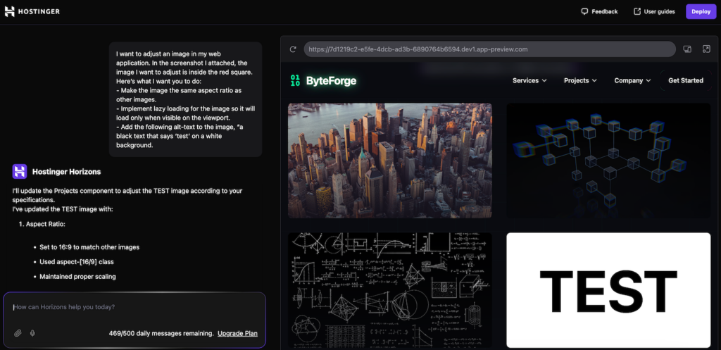
Here’s an example prompt for optimizing images in your web application. In this case, we use an image to tell Hostinger Horizons which visual to adjust:
I want to adjust an image in my web application. In the screenshot I attached, the image I want to adjust is inside the red square. Here’s what I want you to do:

- Make the image the same aspect ratio as other images.

- Implement lazy loading for the image so it will load only when visible on the viewport.

- Add the following alt-text to the image, "a black text that says ‘test’ on a white background.
Conclusion
AI web app development platforms like Hostinger Horizons help streamline your web app creation process. While using such tools requires little to no technical expertise, you still need to consider the design.
This aspect is important because users are more likely to stick with a well-designed application. After all, it is easier to use and navigate.
When creating a web app, consider these design tips, from choosing the correct fonts to strategically placing images. If unsure, you can ask AI to use other applications as references and give them its own twist.
When creating an application using Hostinger Horizons, try the design prompts we have discussed in this article to elevate your application’s visual appearance.
Hostinger Horizons web design tips FAQ
What are the main steps in designing a web app using AI?
To design a web app using AI, start with planning the layout. Next, ask the AI to build the main prototype of the user interface. Once built, refine the smaller visual details gradually, starting from the color and moving to to button placements. Remember to focus on iterating one element at a time until you get the desired result.
Is AI-generated web app design as good as human design?
They are very similar. After all, AI-generated web design is the fruit of human thinking, with the AI handling the coding part. However, AI may not be able to produce the exact design the user envisioned, making it not suitable for complex and intricate projects that require code-level modification.
Can Hostinger Horizons create a responsive web design?
Yes. Hostinger Horizons automatically creates a web app with a responsive design. You can check how your project looks on desktop and mobile viewports by toggling the option in the preview pane.

Aris is a Content Writer specializing in Linux and WordPress development. He has a passion for networking, front-end web development, and server administration. By combining his IT and writing experience, Aris creates content that helps people easily understand complex technical topics to start their online journey. Follow him on LinkedIn.

Ariffud is a Technical Content Writer with an educational background in Informatics. He has extensive expertise in Linux and VPS, authoring over 200 articles on server management and web development. Follow him on LinkedIn.